Root Cause#
The quality control chart often uncovers only a symptom of the problem. Six sigma has several tools that have proved very helpful in getting beyond these symptoms and uncovering their root cause:
- Histograms
- Pareto Charts
- Fishbone Diagrams
Parto Principle#
The 80-20 Rule#
The pareto principle is often applied to process analysis and improvement product. For example, 80% of the income in that country went to 20% of its population. Indeed, this principle has been found to apply to a wide spectrum of activities and is now referred to as the 80-20 rule.
A Pareto chart is a variation of the histogram, in addition to identifying the maginitude of the problem that each category represents, the Pareto chart also displays the cumulative contribution associated with solving more than one problem. The pareto chart might indicate that by addressing the top three problem, a total of 83 percent of the problem may be resolved. Here is a step by step guide:
Constructing the Chart#
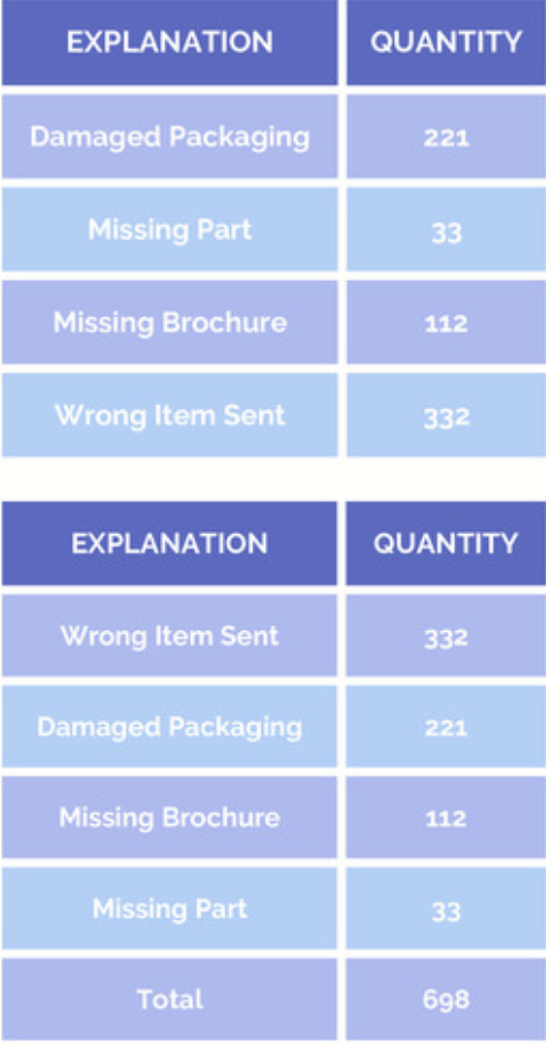
Here is a table for Taudler Toys. The second table is displaying the data sorted from highest to lowest quantity.
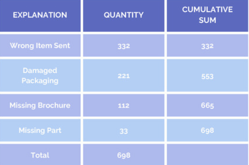
Next, the cumulative sum of the number of occurences for each category is calculated. This number is enter into a new column which is “cumulative sum”.
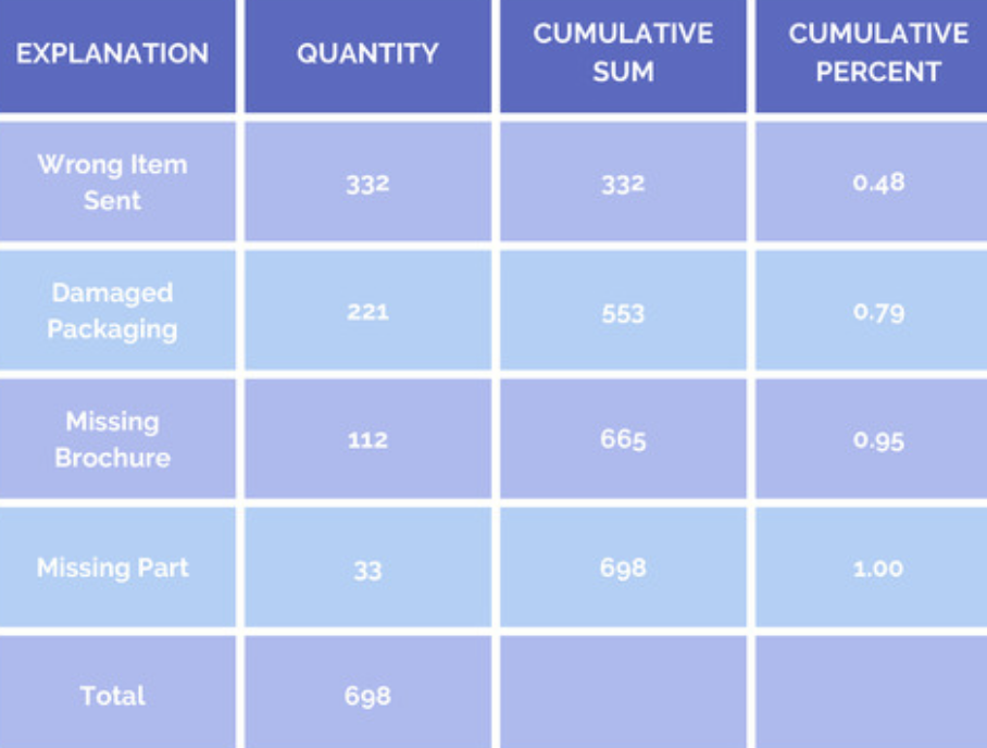
Next is to convert hte cumulative sum into a cumulative percent column. The cumulative percent for Damaged Packaging is 0.79. This means that the wrong item sent together with damaged packaging represents 79 percent of all returns.
Next is the draw the histogram, and adding a cumulative percent as a line to the histogram. A Paroto Chart is completed!
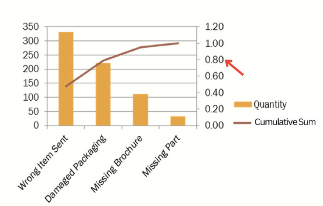
The line plot tells us that by focusing on the “wrong item sent”, we will have addressed 48 percent of the product return problem. The 48 percent figure is read from the right hand vertical axis. The line plot alos show us that by focusing on the wrong item send and damaged packaging, we will ahve address 79% of our problem.
Pareto chart help establish where limited resources should be directed. Correspondingly, it also tells us which problem should be left for a later time.
Fishbone Diagram#
This is another tool often used to drill down and expose the root cause of a problem. It is call a Fishbone Diagram, sometimes referred to as an Ishikawa diagram, It is also referred to as a Cause and Effect Diagram because it connects the cause of a problem to the effect of the problem.

Process Variation#
As we have learned, the mean output level is just one of two important dimension of process performance. The second is variation. In fact, it is so important that many organizations place a higher priority on managing variation than process mean.
There are two source of variation
- Common Cause Variation. It represents the normal or expected random variation in a process. Non only is it inherent in any operational process, but it is predictable. Example would be the variance in call center repsonse time or the difference in the yields of a chip manufacturing process. In general, there is little that can be done to reduce these variance short of redesigning the entire process.
- Special Cause Variation. It is the kind of variation that is of most concern in six sigma it is a variation that is not inherent in the process and as a result, it is not predictable for example, the quality of running shoes deteriorates; the sole separate from the shoes body. Upon drilling down, it is found that the roots cause is a defect in some machines that attach the sole to the shoe’s body. Problem such as this is not predictable and can be contribute to a problems with the process. Moreover, this is precisely the kind of problem that an effective monitoring and control system is designed to uncover before too many defective shoes are produced.(There is somthing wrong with the manufacturing process itself)
Multi-Vari#
Source of variation#
When it is determined that excessive variation in process output could be attribute to special cause variation the first step is to identify the suspect of variables. A good place to start is either the SIPOC or Fishbone diagrams. But when using this tools, it can still be difficult to distinguish between those variables that contribute to the problem and those that are less important so we need more information.
One very simple approach to narrowing the numbers of variables is called Multi-Vari analysis, for which a graph is created that displays the possible source of variation affecting the process output. It is a rather informal process and one that visual. No attempt is made to use statistic as the means of measuring extent of the variation. Nonetheless, It is often considered to be a very useful analytical tool.
Let’s consider the following example: suppose you are about analyze call length at 3 call centers located at atlanta, London and Philippines. Callers expect a quick and effective response to their problem and recent complains has suggested that call variation could be out of control.
We need to narrow down the variables using fishbone diagrams, five sources that could affect call length have been identified. They include the type of request the date of the week, location of the call center ,and the hours of the day is the call is received, and the customers category, corporate or individual.
While file variables are suspected of inferencing call length it is still unclear which one’s contribute more and which contribute less to the overall variability.
According to the Pareto Principle, we should expect one or tow variable to account for the major portion of the total variance in the system. The Pareto Principle states that 80 percent of a problem can be traced to 20 percent of its possible causes.
To narrow the problem down, it will be necessary to measure it by collecting data for each of these varibale by call center location and then constructing a Multi-Vari Chart.
Multi-Vari Chart#
The data for call duration across all three locations have been collected. A multi-vary chart comparing the duration for each of these locations is shown to the right.
Almost all Multi-Vari charts take this basic form, yet they do differ somewhat depending on the problem and the person designing the chart
In our example, the length of the vertical lines above each location represents the range from the longest to shortest call duration over a period of one week.
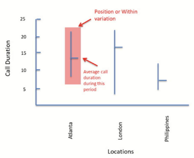
The horizontal bar in the center of the vertical line represents the average of these calls. In Atlanta, for example, call durations ranged from a low of 7.5 to a high of 22. The average call was 13.5 minutes long. The data within the vertical bar represents what is commonly referred to as position or within variation.
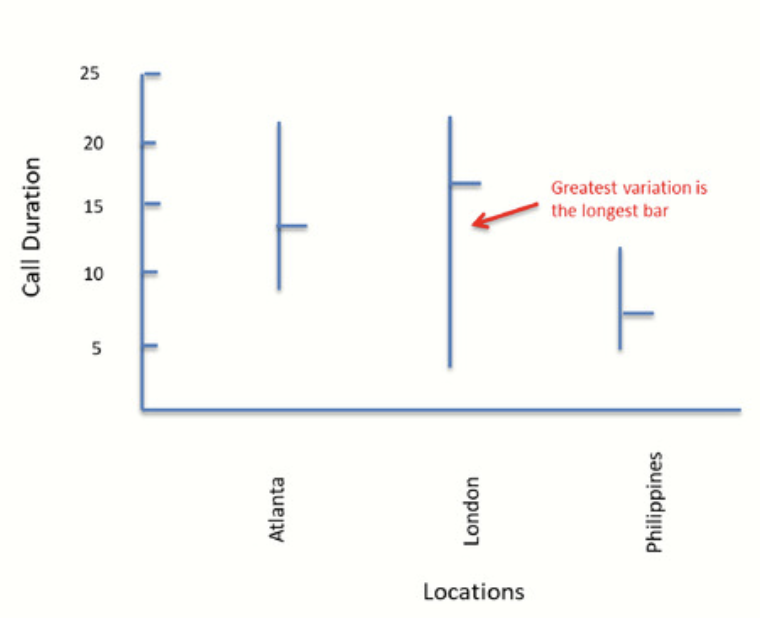
From this chart, we can see that variation is greatest for London and least for the Philippines. It can also be seen that average call durations are not equal and are the longest in London. To narrow that problem, we can conclude that call duration, as well as variation between calls, is less of a problem in the Philippines and more of a problem in London.

In the example just completed, we have only considered the consequence of location on Call Duration. To the right is a chart that compares Hour of Day and Calls Duration. Calls from 8 to 9Am have been sampled across all locations and added together. This has also been done for calls from 12 to 1 and from 5 to 6.
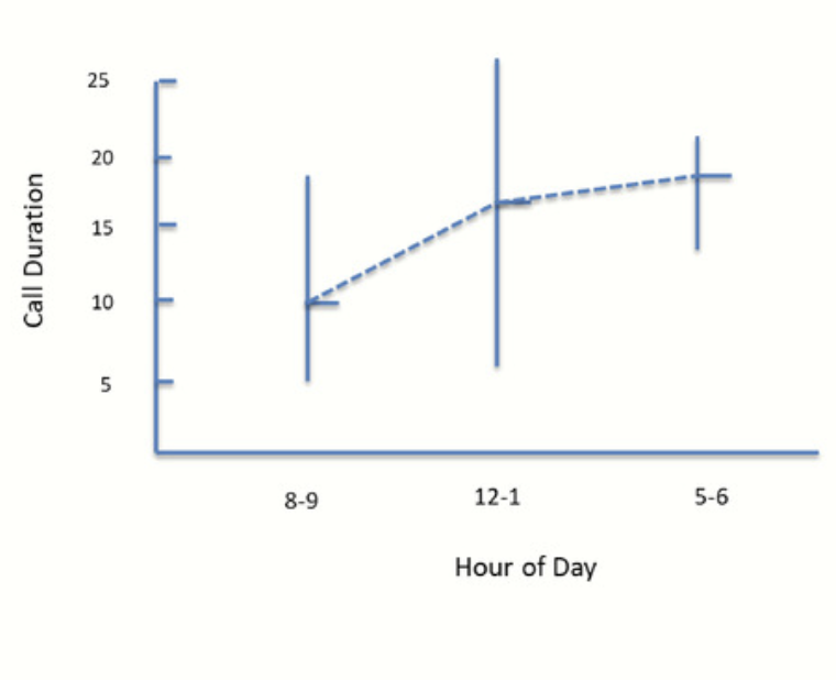
Call Duration By Hour#
From the following chart, we can see that calls received between 8 to 9 range from 5 to 19 minutes. The average is 9.6 minutes. The range for call received between 12 to 1 is 6 to 27, with an average of 16.2 minutes, while the range for calls between 5 to 6 is from 12 to 21 minutes, with an average of 17.2 minutes.
By connecting the averages, we can conclude that the average increase throughout the day. Furthermore , the variance is largest at noon.
Combining Variables#
Often Multi-Vari Charts combine variables. Consider the relationship between location, call duration, and time of day.
The chart to the right suggests how all three can be displayed. The vertical lines, representing the Hour of the Day, have been grouped by call center location.
For example, the first vertical bar in the matrix displays calls duration at Atlanta. The range is between 7 and 18.5 minutes, with a mean of 9.7 minutes.
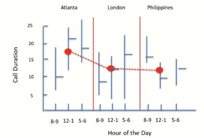
The red dots within each group represents the averages for each location. The red lines represent the changes in these averages from one location to another. The average for Atlanta, for example, is 16.5 minutes.

Application in Health Care#
A critical variable in health care is the Length of Stay, LOS, in a hospital.
The data for orthopedia surgery has been collected across three hospitals in the same health care system and for three quarters. The Multi-Vari data plot is shown to the right.
The green dots show the average length of stay for each hospital across all three quarters. A line through these dots represents the average LOS across the three facilities.
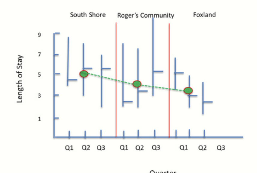
We first notice that the average length of stay is not the same across all hospitals, with South Shore reporting the longest and Foxland reporting the shortest average stays.
Also, notice that Roger’s experiencing an increase in length of stay while Foxland’s is decreasing. This is referred to as a Temporal Variation. As its name suggests, it represents the extent of variation over time. When turn to within variation, the greatest variation is found at Roger’s site, with the least at Foxland.
Summary#
There is a lot to be learned by simply plotting the output of a process on a Multi-Vari chart
When this is done, the mean of the process becomes clear, as does precess variablility. Further, we learn this without using statistics.
In general, these charts are used to identify the major sources of variation in a process. Later in this course, you will have a chance to use statistical tools, including hypothesis test and regression analysis, to futher explore the significance and cause of variation.